
Power Users Need A Different Kind Of Dashboard :
Most analytics tools are easy to like for ten minutes. Databox is different because the official product is built for teams that want to go beyond “pretty dashboard” and actually use data to make decisions. The platform brings together metrics, dashboards, reports, goals, OKRs, datasets, APIs, and AI analysis in one place, which is why it makes sense for power users, analysts, agency operators, and founders who keep asking for one more layer of visibility.
If you want to test the platform while you read, start your Databox trial here.
Why Advanced Users Like Databox :
The simplest way to describe Databox is this: it tries to make data useful without making everyone become a data engineer.
The official site highlights a few things that matter right away:
- AI Analyst, called Genie.
- Metrics and KPI tracking.
- Dashboards and reports.
- Goals and OKRs.
- Data preparation through datasets.
- Custom integrations and API support.
That combination is what turns Databox from “another reporting tool” into a real operations layer. If you are an advanced user, you are probably juggling more than one dashboard, more than one client, or more than one team. You need something that can centralize the mess without flattening the detail.
The Advanced Feature Set That Actually Matters :
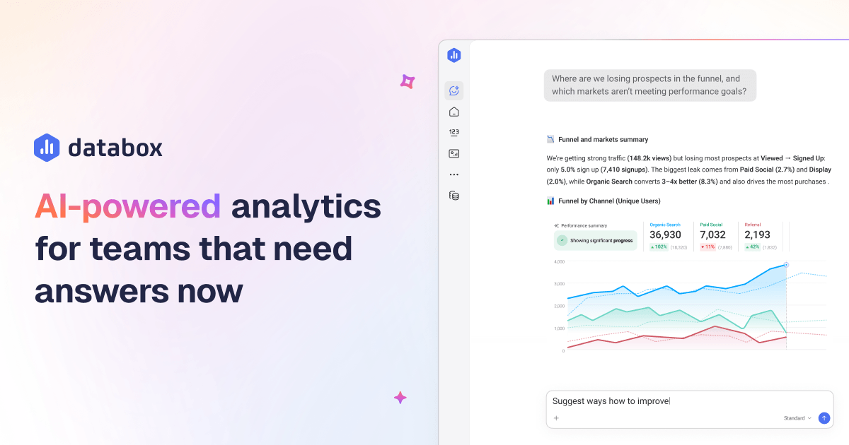
AI Analyst For Faster Questions –
Databox puts a big bet on Genie, its AI Analyst. The official copy is clear: ask questions about performance and get contextual answers in seconds. That is valuable when you do not want to build a fresh report every time someone asks a basic question with a complicated answer.
For a power user, this means:
- Faster ad hoc analysis.
- Less time digging through dashboards.
- Better first-pass answers for leadership.
- A cleaner bridge between metrics and action.
The best part is that it is not trying to replace everything else in the product. It sits on top of the data you already have.
Dashboards And Reports At Scale –
Databox is still a reporting tool at heart, but the advanced use case is where it gets interesting. The pricing page shows that higher tiers unlock more dashboards, reports, custom metrics, and data sources. That matters because serious teams do not just want one dashboard. They want a reporting system that can keep up with multiple audiences.
In practice, that means:
- Leadership dashboards.
- Client dashboards.
- Channel-specific dashboards.
- Forecasting and trend views.
- Automated summary reports.
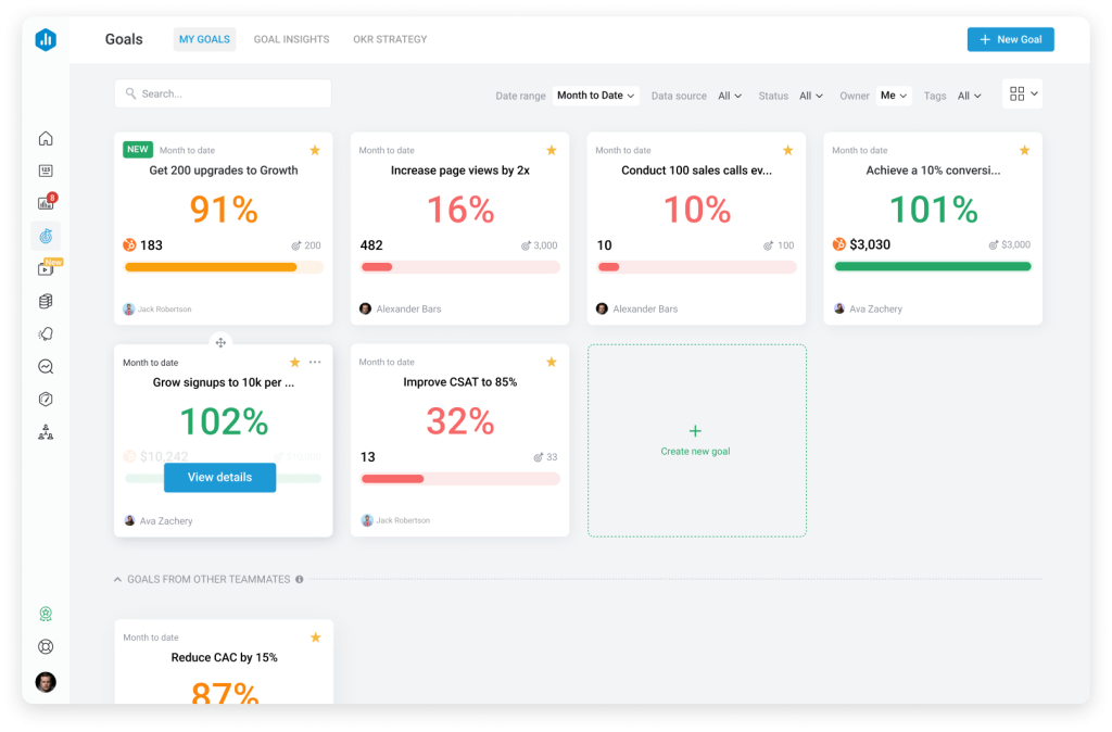
Goals And OKRs For Operational Teams –
A lot of analytics tools stop at measurement. Databox goes further by letting teams define goals and OKRs. That is exactly what advanced users want when they are trying to align reporting with outcomes instead of vanity metrics.
This is useful if you are:
- Running a client services team.
- Managing growth targets across channels.
- Tracking revenue or pipeline goals.
- Trying to reduce the gap between reporting and accountability.
When goals live beside reporting, performance conversations get a lot shorter. That is a good thing.
Datasets And Data Preparation –
The data preparation layer is easy to overlook, but it is one of the most powerful parts of the product. Databox lets teams prepare and standardize raw data for deeper analysis. That is important when your sources are not clean, your naming conventions are messy, or you need a custom table before anything becomes useful.
For advanced users, datasets solve the ugly middle of analytics:
- Raw source data comes in inconsistent.
- The team wants a cleaner reporting model.
- Someone needs to merge fields, calculate columns, or filter rows.
- The final dashboard needs to look simple even if the inputs are not.
That is exactly the kind of behind-the-scenes work that separates a nice-looking dashboard from a reporting system people actually trust.
Integrations That Cover The Real Stack –
Databox is strong on integrations, and the official pricing page is blunt about it. It connects to cloud tools, spreadsheets, databases, and custom APIs. It also calls out HubSpot, Google Ads, Shopify, Facebook Ads, Google Analytics 4, LinkedIn Ads, Stripe, QuickBooks, Salesforce, Pipedrive, Google BigQuery, MySQL, PostgreSQL, Snowflake, Excel, Google Sheets, Zapier, Make, and Dataddo.
For advanced users, that means you can build around the stack you already own instead of forcing a brand-new workflow.
If you want to go deeper, view Databox here.
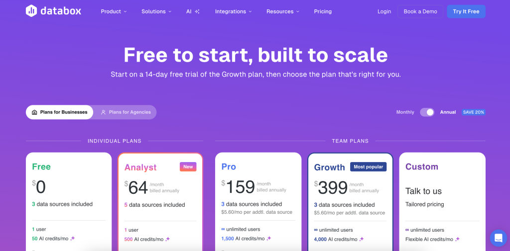
Pricing For Power Users :
Databox is one of those products where the pricing tells you what kind of buyer it wants.
The official pricing page shows:
- Free at $0 per month billed annually, with 3 data sources.
- Analyst at $64 per month billed annually, with 5 data sources.
- Pro at $159 per month billed annually, with 3 data sources listed on the page and add-ons for more capacity.
The broader message is clear. Databox is friendly to entry-level users, but the platform is designed to scale into a more serious analytics stack as your reporting needs grow.
For a power user, the real question is not whether the free plan exists. It is whether your workflow is already complex enough to justify the paid layers. If the answer is yes, the value usually comes from less manual reporting, faster visibility, and a smaller gap between data and decision-making.
Expert Workflow Example :
Imagine you run a marketing agency and your clients all ask for different dashboards. One client wants daily pipeline data, another wants ad performance and ROAS, and a third wants a simple executive summary every Monday morning.
Here is how Databox helps:
- Pull in CRM and ad data from the right integrations.
- Clean and standardize source data in datasets.
- Build a dashboard for each audience.
- Add goals so the reporting is tied to outcomes.
- Use Genie to answer follow-up questions without rebuilding every chart.
That workflow is powerful because it saves both your analysts and your account managers from a lot of repetitive work.
Performance Optimization Tips :
If you want Databox to feel like a serious operating system instead of a pretty reporting toy, I would optimize it this way:
- Keep source naming clean from day one.
- Use datasets when raw data needs shaping.
- Build one dashboard per audience, not one dashboard for everyone.
- Use goals and alerts to trigger action, not just observation.
- Treat AI Analyst as a shortcut to answers, not a replacement for thinking.

That last one matters. Advanced analytics gets useless fast if every answer is treated like a magic trick instead of a decision aid.
What Databox Does Better Than Most Tools :
The strength of Databox is that it sits comfortably between BI software and easy SaaS reporting.
It is stronger than a lightweight dashboard app when you need:
- More serious data modeling.
- More integration depth.
- More audience-specific reporting.
- More automation around performance tracking.
It is easier than a full BI build when you want:
- Faster implementation.
- Cleaner self-serve reporting.
- Less engineering overhead.
- A more approachable interface for non-technical teammates.
That balance is why advanced users keep coming back to it.
What To Watch Out For :
There are two obvious tradeoffs.
First, you still have to structure your data well. Databox can make bad data easier to see, but it cannot turn bad data into good strategy.
Second, advanced users can overbuild dashboards very quickly. More charts do not always mean more clarity. In fact, they usually mean the opposite.
So the discipline is simple:
- Use fewer dashboards.
- Use clearer questions.
- Use goals to focus the team.
- Use AI to speed up analysis, not to justify noise.
When Databox Feels Like A Win :
Databox tends to feel most valuable when your team is already living in performance conversations.
That includes:
- Agencies that need recurring client reporting.
- SaaS teams that want one place for channel, product, and revenue metrics.
- Founders who want a clean operating snapshot every morning.
- Analysts who are tired of rebuilding the same report in three different formats.
The product is strongest when the question is not “can we build a chart?” but “can we make a better decision faster?” If that is the question, Databox gives you a lot to work with.
You can also treat the platform as a shared language layer. Instead of five different team members interpreting five different dashboards, you can push everyone toward one metric model and one operating rhythm.
That is a huge deal in practice, because reporting problems are often really alignment problems.
If you are ready to test that workflow, start your Databox trial here.
Final Verdict :
Databox is best for advanced users who want analytics, goals, reporting, and automation to live in one operational system. If your team has outgrown basic dashboards and you want a cleaner way to move from raw data to decisions, it is a very strong fit.
If that sounds like your stack, start your Databox trial here and see how quickly it can become the team’s default source of truth.
FAQ :
Is Databox only for analysts?
No. The product is very usable for analysts, but it is also built for founders, agencies, and functional leaders who need clear reporting without building everything from scratch.
Does Databox support custom data?
Yes. The official pricing page highlights datasets, custom integrations, and API support, so advanced users can work with both standard and custom sources.
Is the free plan useful?
Yes, if your reporting needs are small. But the real power starts to show once you are building multiple dashboards, relying on goals, and connecting more sources.
What makes Databox different from a simple dashboard tool?
The mix of AI analysis, goals, datasets, reports, and integrations makes it more than a dashboard viewer. It is closer to a reporting workflow platform.
Who should upgrade first?
Teams that need more sources, more reports, more automation, or more serious performance monitoring should move beyond the free plan sooner rather than later.